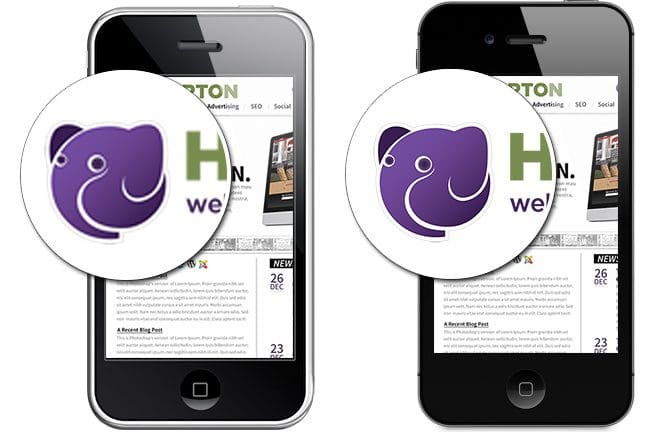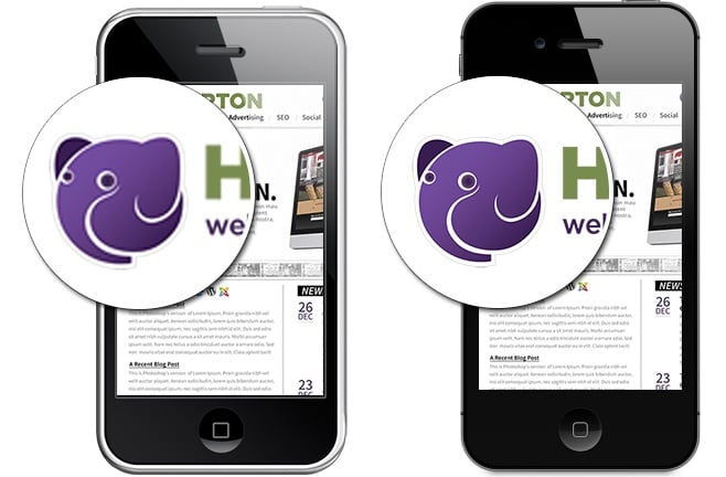
Web design for retina display

With Apple’s high-resolution Retina displays now released across their entire product line, web designers and web developers are facing a shift in the way they create content for the web. There are already millions of users browsing the web using high-density Retina displays, and regardless of how quickly widespread adoption takes place, it’s increasingly important to ensure that these users aren’t disappointed. Most web designers, especially those working with mobile applications and user interfaces, are finding that this rapidly expanding demographic is having a growing impact on the web development processes and the finished products they present to their web design clients.
Several techniques can be employed to ensure an excellent visual experience, regardless of the user’s display. The most obvious solution is scaling images to match new Retina display densities, but it’s important to remember that this will increase load times for all users, even those who won’t benefit from the increased resolution. This method can be fast and effective when working with a few small icons or in situations where complete control over every pixel is more important than performance, but for most projects there are other options offering fewer drawbacks.
Switching to scalable vector graphics or icon fonts allows users to see graphics optimized for their display, without increasing load times. Often, these scalable images are smaller than traditional web graphics, and will actually improve site performance. Because vector graphics and icon fonts are easily created or purchased in all price ranges, this method is an excellent starting point for designers looking to target a growing population of Retina users. Animations or more complex graphics and website components, however, can be difficult or impossible to implement in this way.
Many of these more complex components can be handled using JavaScript and CSS, reducing the number of images needed or eliminating the need for images completely. With most modern browsers now supporting CSS3, and JavaScript support almost universal across all platforms, this method can fill most of the gaps not covered by vector graphics and icon fonts. Things like rounded corners, drop shadows, gradients, and rotation of elements and text can now be reliably and consistently accomplished with no images at all. Using these methods will ensure that each user is presented with a visual experience automatically optimized for their display. Animations traditionally rendered in Flash or GIF format can often also be recreated using CSS3 and JavaScript, drastically improving performance and ensuring proper scaling for all resolutions.
Retina displays have taken web graphics to a new level, but in doing so they’ve also introduced a number of new obstacles. In order for creative professionals to continue delivering exceptional user experiences on the web, good communication is more important than ever between web designers and the front end developers they deliver their finished web designs to. It’s no longer possible to just slice up web design and recreate them graphically for the web. Web designers must be thinking about how their web designs will be best translated into front end code and work closely with the rest of the web development team to ensure that these strategies are implemented in a way that preserves the best possible experience for the user.